Case · Theming · BELLA, 2026
One system, many faces.
Themes in BELLA swap the values, never the components. Watch the same screen change, token by token. Nothing to scroll or click.
01 · The exhibit
Change the theme, not the code.
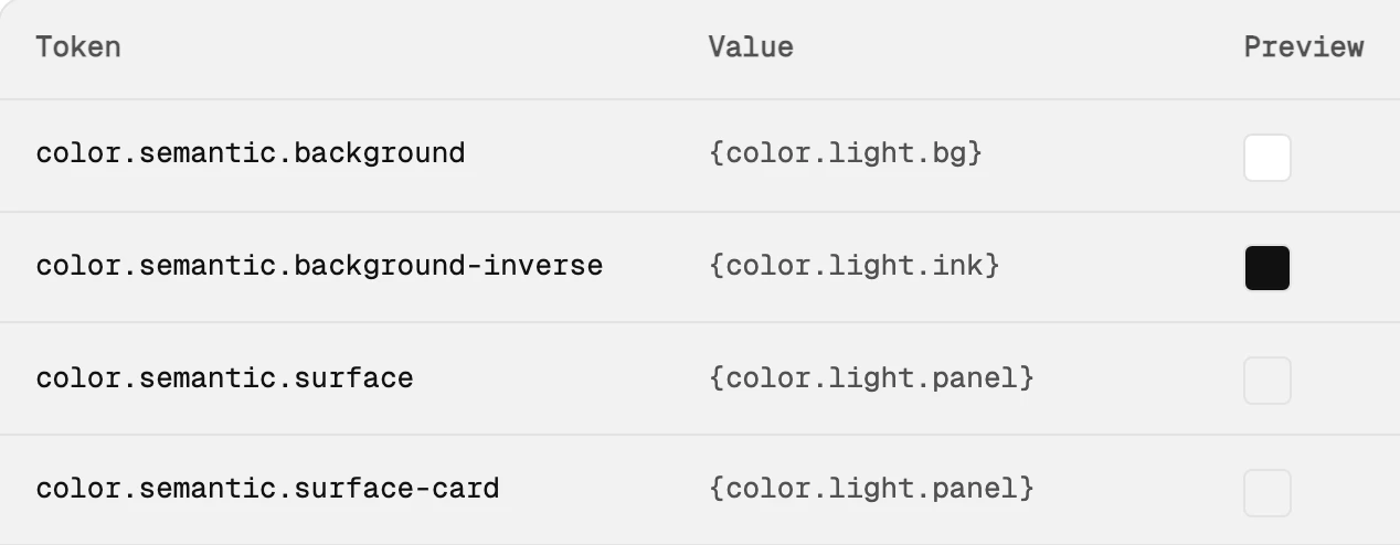
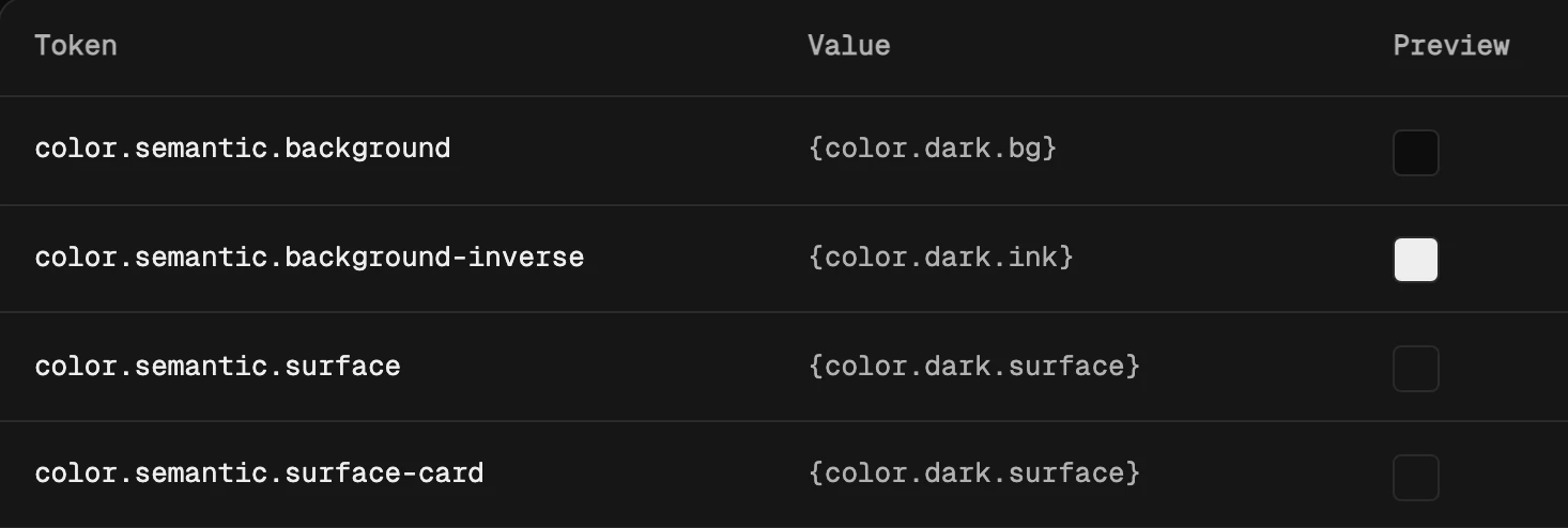
01b · In Storybook
One name, two answers.
A component asks for background. Light mode answers white; dark mode answers near-black. The name never changes.
{color.light.bg}#ffffff{color.dark.bg}#0d0d0dand here it is in the real Storybook table ↓
02 · Decisions
Name the job, not the colour.
Components only read meaning. A button reads action, never blue-600.
Four themes above, one component tree. Switching theme swaps nine semantic pointers and touches zero components.
A new brand or market is a token file, not a redesign. And it can't ship below the contrast bar.
// tier 2 · ground.tokens.json · the same names in every theme
{
  "theme": "ground",
  "semantic": {
    "bg": "{neutral.0}",
    "panel": "{neutral.1}",
    "line": "{neutral.2}",
    "muted": "{neutral.5}",
    "ink": "{neutral.7}",
    "action": "{neutral.7}",
    "on-action": "{neutral.0}",
    "accent": "{brand.3}"
  }
}
02b · From the repo
The real files, not a slide.
These are excerpts from BELLA's public repo. Light and dark are the same names pointing at different values.
In plain words: each name on the left has one answer for light mode and one for dark.
"text-primary"   {color.light.ink}      {color.dark.ink}
"text-muted"     {color.light.muted}    {color.dark.muted}
"surface-card"   {color.light.panel}    {color.dark.surface}
"border-strong"  {color.light.control}  {color.dark.control}
"focus-ring"     {color.brand.ochre-deep} {color.brand.ochre}
"chip-1"         {color.chip.c1}        {color.chip.c1}   // same in both
In plain words: the Button's rulebook. Which versions exist, which states it has, and how not to use it. People and AI tools both read this.
"button": {
  "name": "Button",
  "variants": ["primary", "secondary", "tertiary"],
  "states": ["default", "hover", "active", "focus", "disabled"],
  "dont": [
    "Do not render more than one primary per view",
    "Do not use for filters, toggles, or sort"
  ]
}
In plain words: the reading order. Raw values first, then what they're for, then what uses them.
"tokenSetOrder": [
  "primitive",       // tier 1 · raw values
  "semantic/light",  // tier 2 · what it's for
  "semantic/dark",
  "component"        // tier 3 · what reads it
]
02c · How it ships
From a token file to production, through a gate.
DTCG tokens in, CSS custom properties out. A theme only counts once it's in code. This is BELLA's real pipeline, and every step runs on every change.
Rebuild every token output from the source files.
npm run buildIf the rebuild differs from what's committed, stop. Someone edited by hand or forgot to rebuild.
git diff --exit-code tokens/bella.css tokens/bella.json …Check the code still matches each component's contract.
node scripts/contract-parity.mjsScreenshot every story, compare it, and run accessibility checks.
npm run audit:visual
03 · Side by side
Same card. Four themes. No new components.
04 · The rules
What keeps themes honest.
Components never read tier 1. A new need gets a new named role first.
Dark is a theme, not an inversion. Its own greys, chosen so muted text still clears 7:1.
Colour lives in fills. Text and lines stay ink or grey, so a brand change can't hurt readability.
Every theme passes the gate. AAA for text, 3:1 for controls, checked on every story before merge.
The same names in Figma and code. Designers and developers say
surface.paneland mean the same thing.
05 · Reflection
Themes are a promise about names.
The hard part of theming isn't the colours. It's agreeing on what each role means, so a new brand can arrive without anyone opening a component file.