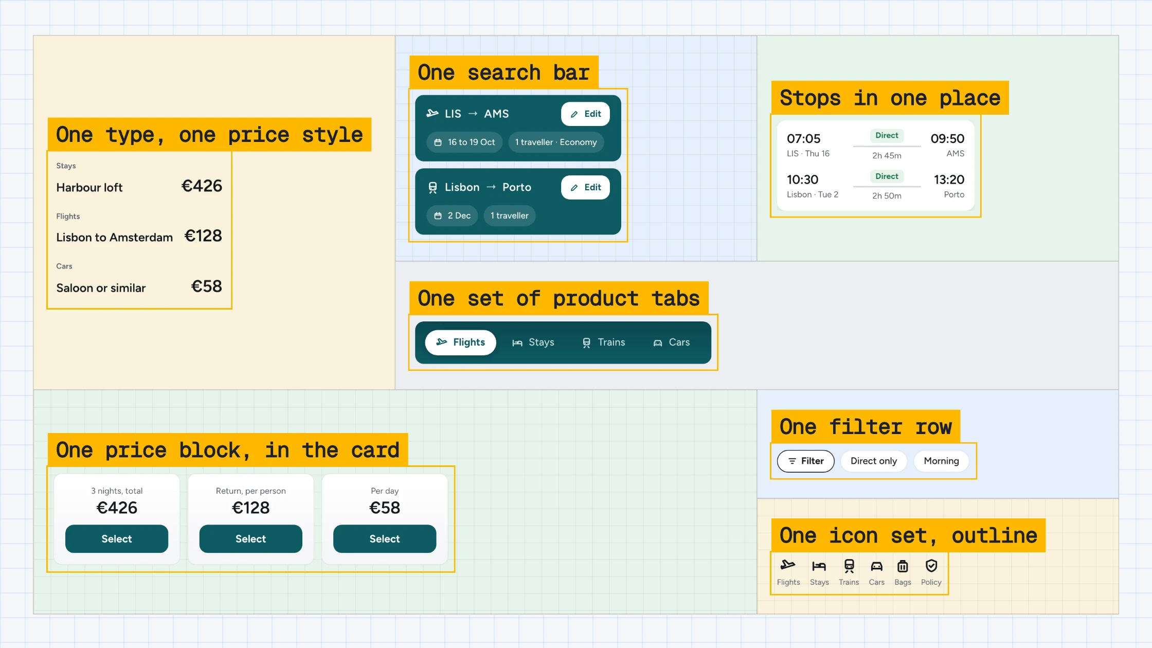
Case study · A B2B travel platform
One search, one filter button.
A legacy booking platform was losing clients to friction. I rebuilt search and filters on top of a back end we couldn’t replace, one piece at a time, mobile first, and shipped full flows in two-week sprints.
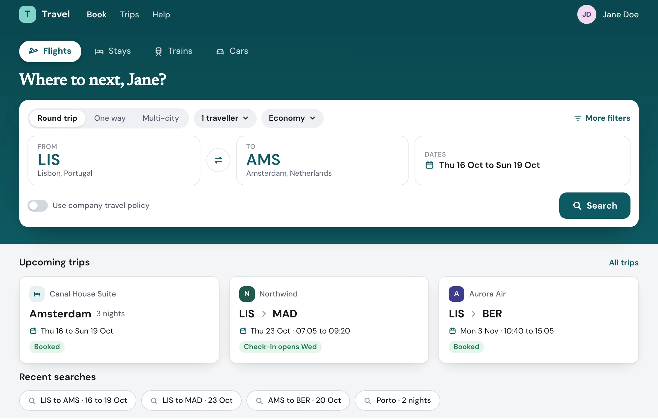
Round trip, one way or multi-destination
What shipped
- 4 verticalsOne search pattern for flights, cars, trains and stays.
- 2 weeksA full flow, designed and shipped, per sprint.
- 1 buttonThree screens of filters became one drawer.
01Before
Change one thing, start again.
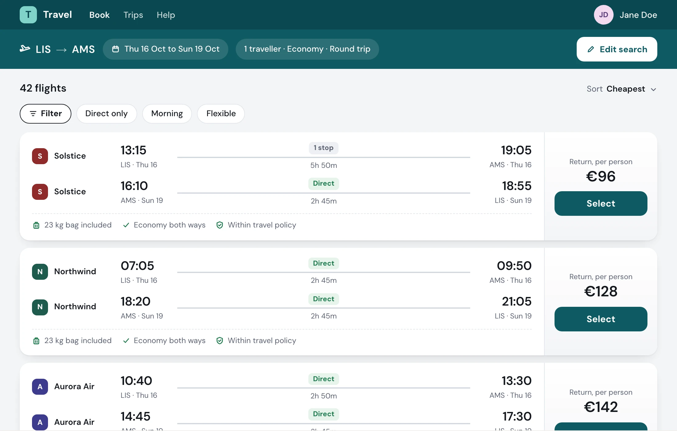
The old results page made people work for every flight. Clients complained, and some stopped booking. Drag the line to compare it with what shipped.
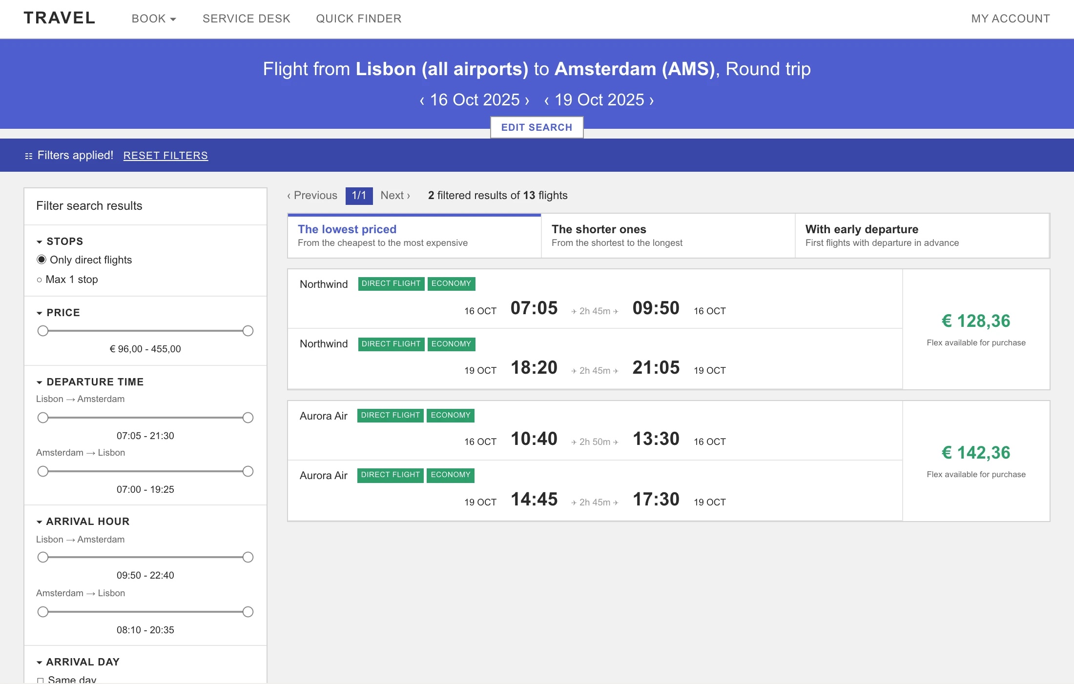
- The search hides in a banner
- “Filters applied!” but not which
- Green tags on every leg
- Three screens of filters
02The options
Sidebar, dropdowns or one button
Expert bookers already know where they are going. The question was how much filter to put in their way.
How I got the yes. Stakeholders said it added a click. I argued one extra click was worth it, in July and again in August 2025, and prototyped the drawer in Figma Make to sell it to my product owner. It shipped on flights and cars.
03Why the drawer
One extra click, worth it.
A live sidebar meant the list reloading on every click and the page jumping back to the top. Choosing first and applying once removed all of that.
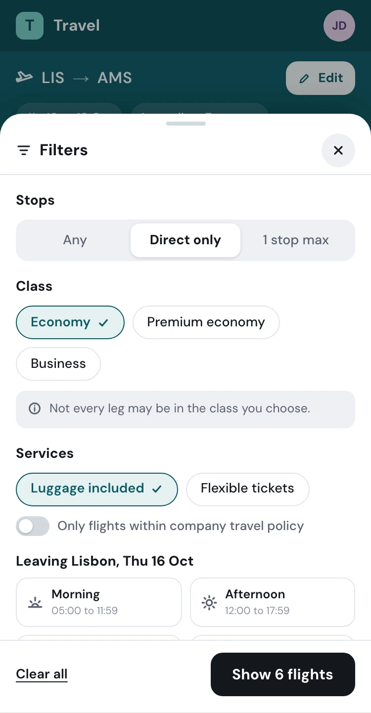
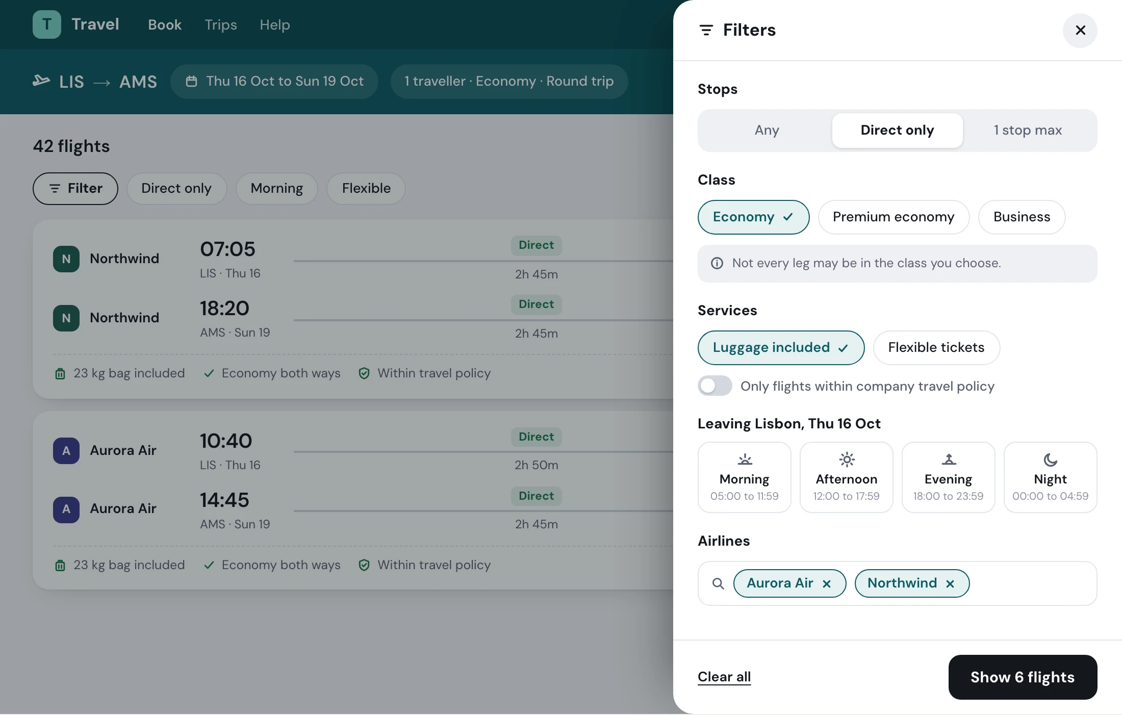
- Mobile: the same filters in a sheet
- Desktop: a drawer, results stay in view
Drawer
- For: A clean results page
- For: Apply in one batch
- For: Scales to many filters, and it is already the mobile pattern
- Against: One extra open and close
Side panel
- For: Always visible
- Against: Competes with the results for space
- Against: Reloads and jumps on every click
- Against: Collapses into a drawer on mobile anyway
From my research board, with NN/g and Vitaly Friedman’s Smart Interface Design Patterns. The recommendation: quick filters inline, the full set in a drawer.
Designed mobile first. I was told mobile wasn’t a priority and built for it anyway. When tracking went in, the data showed much of the use was on mobile, and the mobile screens already existed.
04How I worked
One piece at a time, with the people who build it.
A legacy rebuild, old code to new. Many features had no known reason to exist. With my product owner and the developers I took every filter through three questions.
- 01
Is it needed?
If nobody could say why it existed, it had to earn its place.
- 02
What will break?
The back end couldn’t filter live, so you choose, then press Show results.
- 03
What does the user see?
When the back end can’t answer, the screen says so, with a reason, instead of an empty list.
05Search stays in view
Edit the search where you are.
Expert bookers change one thing at a time. Edit search opens the whole search in place, above the results. Change any field, search again, no restart.
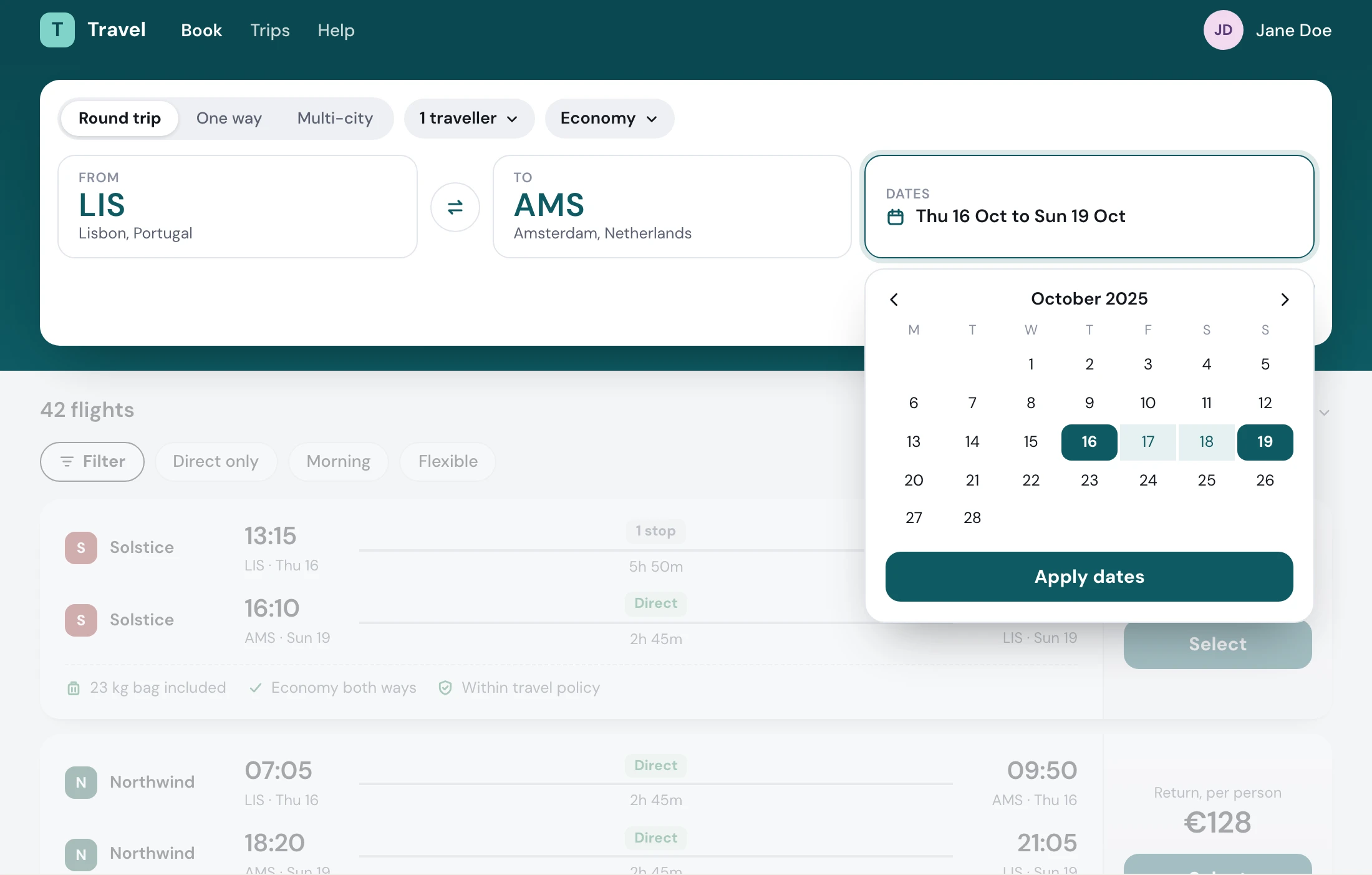
- Change any field without leaving the page
06One filter button
Three screens of filters, one drawer.
The old advanced search and the old filter column became one drawer, the same on desktop and mobile. You choose, press Save, and what you chose stays on the page.
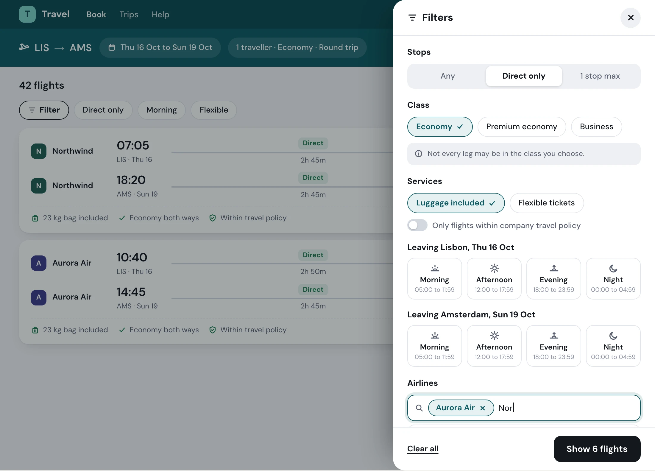
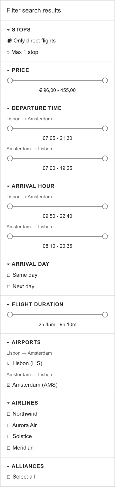
- A class warning, up front
- Times per leg
- Airlines as an autocomplete
- Clear and Save stay at the bottom
Then, back on the results
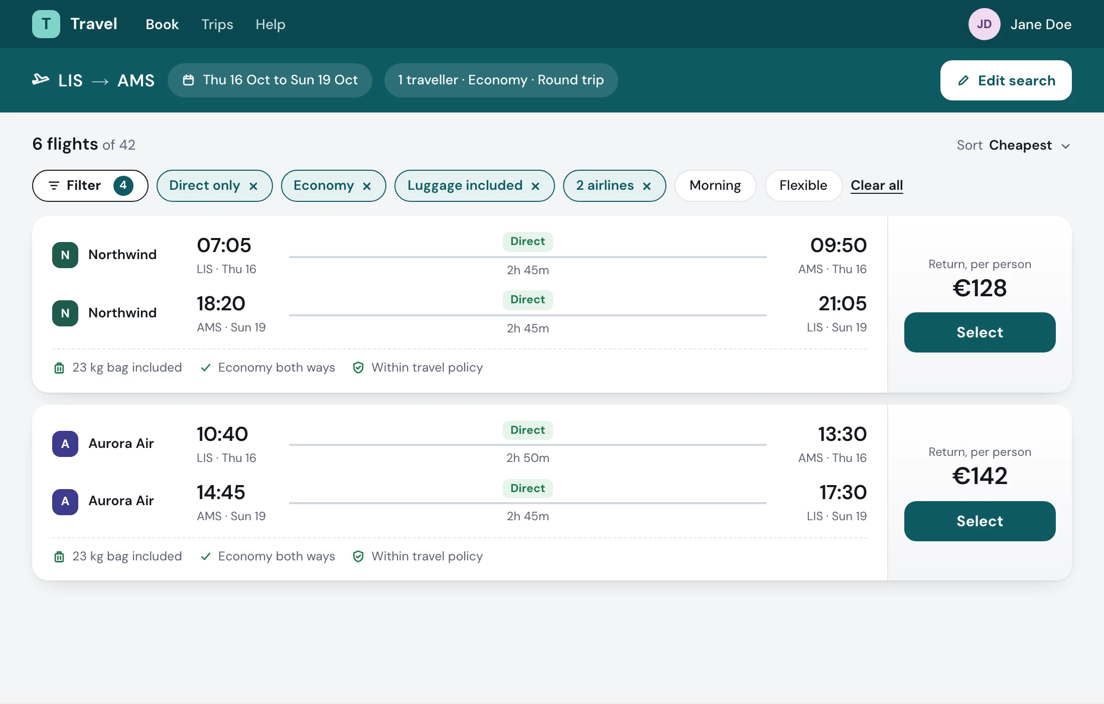
- Remove one without reopening
07The fix you can’t see
Every provider sent a different shape.
Searches for direct flights came back with stops. The cause sat behind the screen: each flight provider sent its data in a different format. I worked it out with the front-end and back-end developers, and changed what the screen promised so people got what they asked for while the back end was being fixed.
Provider Adep: "0705"
Provider Bdeparture_time: "07:05"
Provider Ct_dep: 25500
One shapedeparts: 07:05
- 07:05Direct09:50
- 10:40Direct13:30
- Direct means direct
- Partner airlines show in the results
- Empty filter groups say why
- It worked while the back end was fixed
08What we learned
What I’d keep
- 01
Experts still want familiar patterns.
A drawer people know from their phones beat a custom sidebar, even for people who book all day.
- 02
A limit can become a rule.
The back end couldn’t filter live, so “choose, then show results” became the pattern, not a workaround.
- 03
Build for mobile before you’re asked.
The data caught up, and the screens were already there.
What I’d do next. After launch I listed the fixes from client feedback: the slider’s value while dragging, clear-all beyond the results page, travel dates on the cards. When stakeholders asked to move flight filters into a left panel to match stays, I framed three options for them to decide. My engagement ended in February 2026, so what shipped after isn’t mine to claim.
1 button Three screens of filters became one drawer.
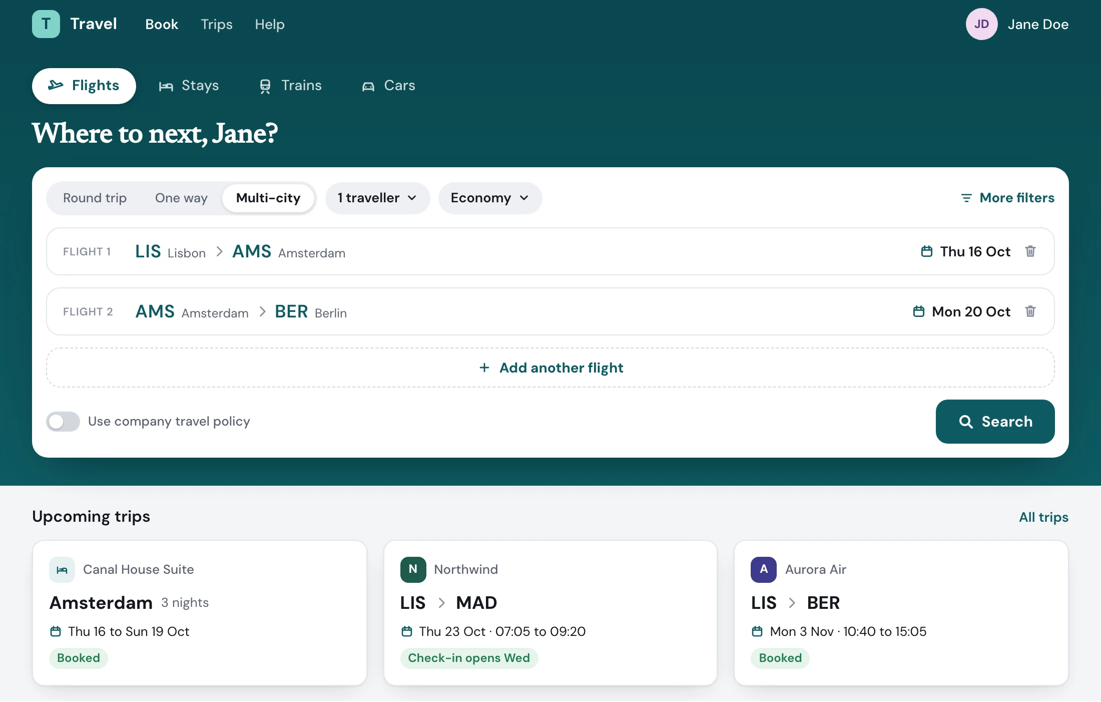
- Round trip, one way or multi-destination
Round trip, one way or multi-destination
This is how I’d start with your system.
An audit, one component through the whole lifecycle, and a gate your team owns.